Calm Beauty, Effortless Refinement
Today we explore Understated Luxury Home Makeovers, where quiet materials, meticulous details, and graceful restraint create spaces that feel deeply personal and serenely impressive. Expect practical guidance, inviting stories from real renovations, and gentle encouragement to pursue comfort, craftsmanship, and harmony without shouting for attention or chasing short-lived trends, while learning how small choices elevate daily rituals and long-term satisfaction.
Quiet Materials, Lasting Impressions
True sophistication begins with surfaces and finishes that whisper rather than announce. Honed stone, limewash, rift-sawn oak, unlacquered brass, and handmade tile age beautifully, inviting touch and forming character over time. By prioritizing provenance, tactility, and repairability, you create rooms that feel considered, grounded, and quietly confident, telling a meaningful story every day without demanding constant attention or extravagant display.

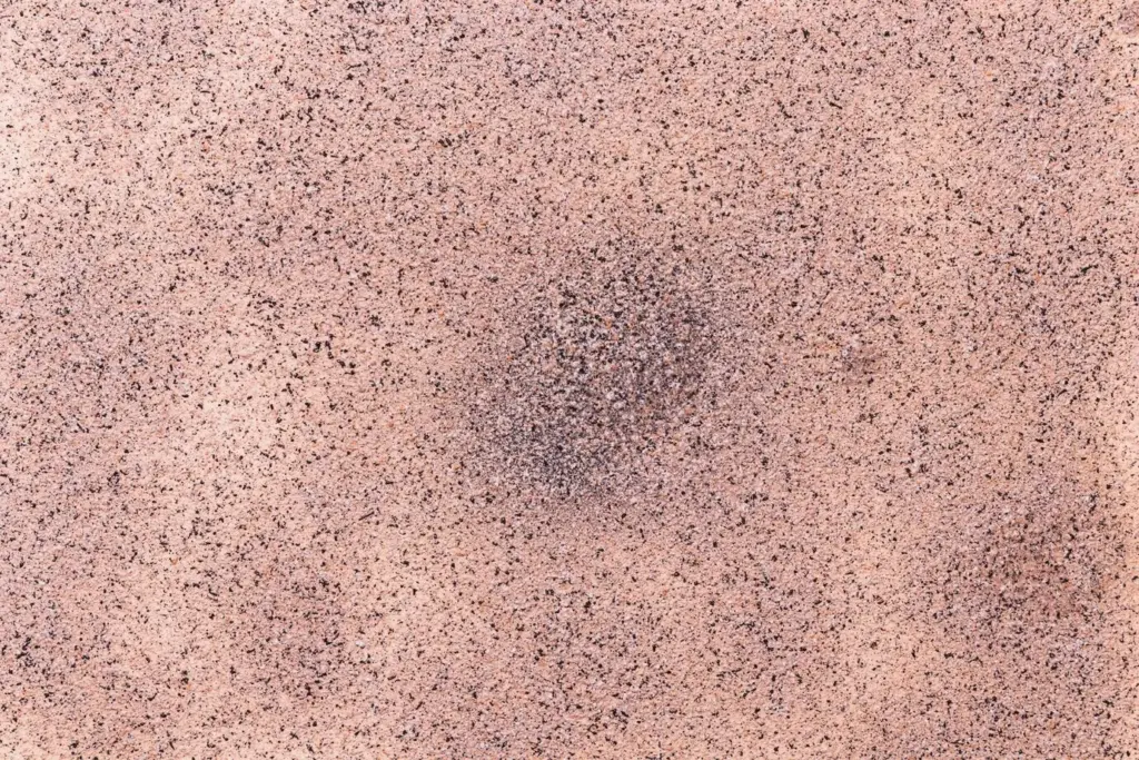
Honed Stone That Softens Light
Choose honed marble, limestone, or quartzite to diffuse reflections and soften daylight, avoiding the glare that polished surfaces often produce. Subtle veining adds movement without visual noise, while properly sealed slabs handle real life gracefully. Over years, delicate patina deepens, rewarding careful upkeep with increasingly nuanced beauty that supports rather than dominates your furniture, textiles, and art.
Unlacquered Metals With Honest Patina
Brass, bronze, and copper in unlacquered finishes gather gentle darkening where hands naturally touch, becoming unique to your household. This authenticity surpasses mirror-shine effects and brings warmth to cool stone or painted millwork. Pair with soft shapes and simple profiles to avoid fussiness. Occasional light waxing preserves function while allowing character to develop at a comfortable, human pace.
Handmade Tile and Subtle Irregularity
Slight variation in handmade tile captures light differently across a wall, adding depth without busy patterns. Choose muted glazes and elongated proportions for calm rhythm. Thin grout lines and tone-on-tone palettes maintain continuity. The result feels crafted and personal, like a favorite linen shirt: quietly luxurious, inviting to touch, and capable of anchoring a space through many seasonal refreshes.
Color Palettes That Whisper
Thoughtful color invites the eye to rest. Build from layered neutrals—warm whites, mushroom taupes, soft greiges—then thread restrained accents like mineral green or inky blue. Consider Light Reflectance Value to manage brightness and balance daylight across adjoining rooms. With sheens kept mostly matte, colors retain calm depth, letting texture and form lead the conversation without visual fatigue or trend-chasing vibrancy.
Layered Neutrals With Nuanced Undertones
Neutrals are not bland when undertones are chosen intentionally. Pair a warm white with a putty baseboard and mushroom interior doors to create gentle contrast. Test large swatches across daylight shifts. When neighboring spaces share a tonal family, the entire home feels coherent and expansive, allowing natural materials and treasured objects to command subtle attention without competing palettes.
Accents That Echo Nature’s Calm
Introduce restrained accents pulled from landscapes: olive leaf, river slate, and clay. Use them on a single paneled wall, a custom console, or dining chairs rather than large surfaces. This approach creates memorable moments while preserving serenity. The accents feel grounded, timeless, and supportive of organic textures, fostering visual continuity throughout your home without loud statements or abrupt transitions.
Sheen Matters: Why Matte Supports Tranquility
Matte and eggshell finishes minimize glare, reduce surface imperfections, and amplify texture in plaster, stone, and wood. Reserve higher sheens for doors and trim where durability is needed. The resulting interplay reads sophisticated and deliberate. Rooms bathed in soft reflection feel restful, allowing your eyes to linger on proportions, craftsmanship, and small details instead of skimming across shiny surfaces.
Lighting That Breathes
Understated luxury depends on layered lighting that flatters materials, skin tones, and artwork without harsh spots. Blend ambient, task, and accent sources around 2700K–3000K with high CRI for accurate color. Dimmers create versatile scenes from morning clarity to evening glow. Concealed strips, shaded fixtures, and sconces craft gentle shadows, shaping mood and dimension while preserving comforting warmth and intimacy.
Ambient, Task, and Accent in Gentle Harmony
Ceiling lights supply overall glow, but sconces, table lamps, and integrated millwork lighting personalize each zone. Place task lights thoughtfully at counters and desks, while accent lights wash textured walls or shelves. This measured balance avoids hotspots and flat brightness, enhancing material nuance and supporting daily rituals—from reading at dusk to hosting friends with quiet confidence.
Color Temperature and CRI for Authentic Color
Choose 2700K for evening relaxation and 3000K where clarity matters. Prioritize CRI 90+ so woods read warm, textiles look true, and art maintains intended tones. Lighting truthfully honoring color protects your investment in finishes and furnishings. The result feels welcoming, precise, and never clinical, enhancing comfort while quietly elevating every room’s visual harmony and emotional resonance.
Space Planning for Calm Flow
Comfort begins with circulation and proportion. Leave generous negative space around larger pieces and keep pathways unobstructed. Scale rugs to anchor zones, not islands. Built-ins swallow clutter so surfaces breathe. When layout supports daily routines gracefully, everything feels considered, effortless, and welcoming, as if the home quietly knows where each activity belongs before you even arrive.

Negative Space as a Design Ingredient
Resist the urge to fill every wall and corner. Treat emptiness like a valuable material that frames your best pieces and enhances acoustics. Fewer items, thoughtfully placed, create calm rhythm. This breathing room signals confidence and care, allowing craftsmanship, texture, and natural light to perform beautifully without the distraction of overcrowded vignettes or muddled visual priorities.
Hidden Storage, Visible Serenity
Conceal daily necessities behind paneled doors, drawer inserts, and integrated charging zones. A place for everything reduces daily friction and visual noise. Choose hardware with soft-close and interiors that feel as refined as exteriors. When cabinets and benches swallow clutter, your counters, tables, and shelves become invitations to pause, appreciate materials, and enjoy uncomplicated moments with family and friends.
Textiles, Texture, and Tactility
Natural Fibers That Age Gracefully
Choose fibers that improve with use: Belgian linen softens, wool resists crushing, and mohair catches light like mist. Tone-on-tone patterns avoid visual fatigue while offering tactile interest. These fabrics feel kind against skin and read sophisticated without sparkle. Their longevity supports sustainability and budget, delivering daily pleasure through texture rather than novelty or unnecessary decoration.
Window Treatments With Gentle Movement
Double-layer drapery—sheers for daylight diffusion, lined panels for privacy—creates depth and thermal comfort. Floor-kissing hems and subtle header details maintain a tailored silhouette. Choose hardware in patinated metal to echo other finishes. As breezes lift fabric, rooms feel alive and peaceful, connecting interior life with seasons outside without sacrificing the intimacy that defines restorative spaces.
Rugs That Anchor, Soften, and Quiet
Hand-knotted wool, understated vintage pieces, and natural jute blends absorb sound and define zones. Scale rugs generously under seating to avoid floating islands. Consider low-contrast patterns to hide wear while preserving calm. Underfoot comfort encourages lingering conversations, grounded reading corners, and morning stretches, transforming floors into tactile landscapes that support life’s rhythms with unobtrusive, welcoming grace.
Art, Objects, and Meaningful Restraint
Start with one compelling work rather than filling every wall. Center a piece at eye level, repeat materials in frames for cohesion, and align edges with architectural lines. Thoughtful spacing turns viewing into a ritual, encouraging slower attention. Over time, the collection becomes a diary of memory and meaning rather than a hurried checklist of fashionable acquisitions.
Let a hand-thrown vessel hold utensils, a stone tray corral remotes, and a carved stool serve as a punctual perch. When everyday items carry material integrity, clutter recedes and character unfolds. This approach merges utility with beauty, making daily routines feel cared for, dignified, and quietly special without adding decorative layers that dilute clarity or purpose.
Arrange in odd numbers, vary heights gently, and echo textures rather than colors. Place one empty surface in every room to rest the eyes. Rotate flowers, books, and candles seasonally, keeping the structure consistent. This rhythm anchors the home, allowing subtle updates to feel intentional while preserving the calm continuity that defines understated, enduring elegance.


All Rights Reserved.